


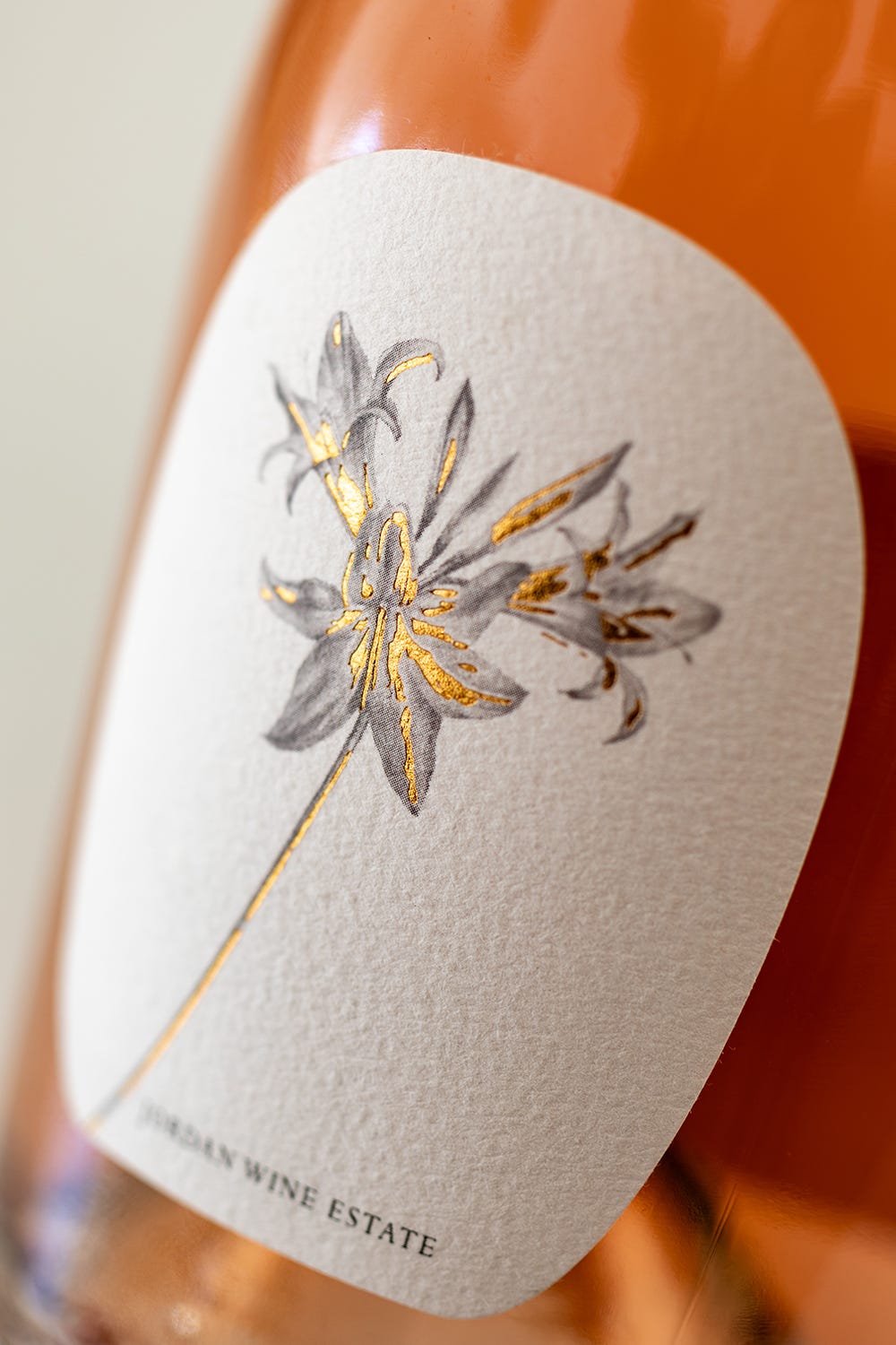
It’s March lily month, a special time of year for numerous reasons, and we’ve finally found the perfect wine to mark the moment: a dry rosé, from Jordan. Yes, it’s a Merlot-driven pink made from free-run juice with all sorts of subtle things on the nose and a slightly creamy texture, but more importantly, it’s a flat-out gorgeous bottle with a carefully crafted, gold-foiled Amaryllis belladonna on the front. Which makes me think of horses.
Some kids had comic-strips in the house. I had the Computaform: a monochrome, newsprint horse-racing guide. Not visually stimulating, but full of great statistics. Dad was, and still is, a fan of betting on the ‘gee-gees’ as my mother used to call them, but the two had competing strategies. Pops devoured the guide, analysing jockeys, trainers, recent results, and lane draws. Mum went for horses with cute names and great manes. And wine is a similar game. There are different ways to access it and I unashamedly admit to being rather influenced by what’s outside the bottle.
So yes, I’m a sucker for great packaging, but I’ve always thought that if someone tells a story, creates an eye-catching or beautiful label or simply calls their product something other than the name of their farm, they’re likely to have taken some care over the contents. More than that though, it means when you serve the wine, it becomes a moment of beauty and surprise; a piece of art to pull out the ice bucket; a story that surpasses aging potential, cellar technique or cultivar.
It’s why I love the annual Winemag.co.za Label Design Awards, perhaps the only event on the vinous calendar where you can guarantee there will be more tattoos in the room than spittoons. It’s a celebration of creativity and problem solving that I find as, if not more, useful than any five-star rating system from a panel of judges who actually know what malolactic fermentation is. Put simply, if the guys from At Pace Strategy and Design hadn’t perfected that Gold award-winning March lily, I wouldn’t have gone out my way to find it.
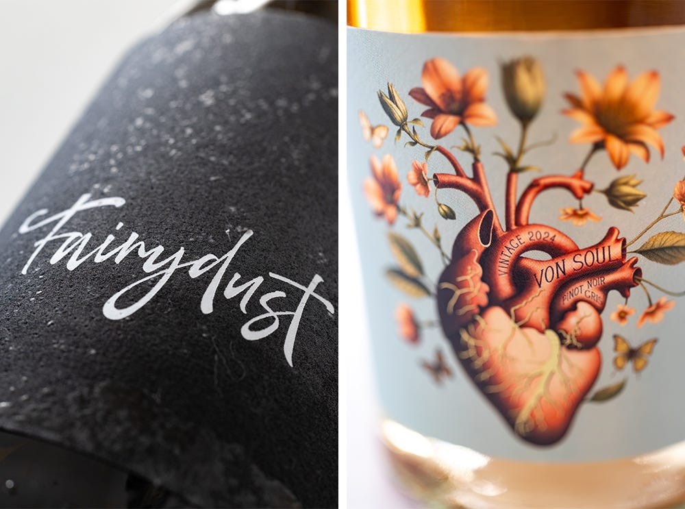
I’d probably not be tempted to spend far more than normal on a bottle of Fairydust (the second Gold winner this year) wondering just how extraordinary this wine must be to have inspired Chenin-guru Ken Forrester to veer miles away from his traditional labels and allow the team at Sumi Creative Co let their imaginations run wild and textured and free. Is it simply a mystical potion, or is the name a hint at what makes this field blend from a vineyard high up in the Piekenierskloof so magical: a small amount of Palomino that casts a spell over the Chenin Blanc?
And I’d never be able to put the glorious anatomical flowerpot of Von Soul on the table and tell my guests the story about how Rudi von Waltsleben, the winemaker, picked the theme of ‘uniqueness’ for his wine label, designed by Simon Frouws. The Pinot Noir and Pinot Gris in the bottle is a one-off blend, and the artwork is inspired by his daughter JL who loves flowers and butterflies and whose doctor diagnosed her heart defect by saying ‘we are all unique’. Sometimes the label is a gentle reminder that there’s a lot more to a bottle of wine than 750ml of fermented grape juice.